
Coordinating Carpet and Window Treatments for a Balanced Home
A well-designed room often feels right before you can explain why. The colors relate naturally. The textures feel balanced. Nothing competes for attention, yet nothing feels overlooked. When you think about how a space comes together, you probably focus first on wall color, furniture, and flooring. Window treatments are often treated as a finishing layer, added after the larger design decisions are made.
Carpet introduces another level of complexity because of its texture, pile height, and pattern. A plush, high-pile carpet carries a very different visual weight than a low-profile loop or subtle pattern. Pairing those textures with drapery, shades, or blinds calls for intention.
Together, carpet and window coverings quietly frame the entire room. One grounds the space with softness and structure underfoot. The other filters light and draws the eye upward, shaping how the room feels throughout the day.
Rather than trying to match materials exactly, it’s more effective to focus on the relationship between tone, texture, scale, and function. When you approach carpet and window treatments as design partners instead of separate decisions, the space feels layered, balanced, and complete.
Creating Color Harmony from the Ground Up
Because carpet stretches across the entire floor and window treatments sit at eye level, the color you choose for each has a strong influence on how unified the room feels. Even small differences in undertone can either support the overall palette or subtly work against it, especially when layered with your wall color.
A beige carpet with warm golden undertones will feel very different from one with cool gray notes, even if both are labeled “neutral.” The same is true for drapery fabrics, shades, and blinds. When these undertones relate naturally, the room feels steady and cohesive. When they compete, the space feels disjointed.
The goal is not to match colors exactly, but instead, aim for visual rhythm. When tones relate to one another, your eye moves comfortably from the floor to the windows and around the room as a whole.
Selecting the Right Tone for Your Room
Deciding whether your window treatments should be lighter or darker than your carpet is one of the most effective ways to control the perceived size of a room.
If you select a carpet in a deep charcoal or a rich earth tone, opting for lighter window treatments can prevent the space from feeling enclosed. Light, airy drapes or soft white cellular shades pull the eye upward toward the natural light source, making the ceiling feel higher. This creates a grounded foundation while maintaining an open, breathable feeling at eye level.
On the other hand, pairing a light-colored carpet—like a soft cream or a pale sand—with darker window treatments creates a sense of drama. The darker fabric at the window acts as an architectural frame, drawing the eye toward the view outside and giving a large, light-filled room more structure.
Working with Neutral Colors
Neutrals provide a versatile backdrop, but they can look flat if you’re not intentional. The key is to look for the underlying tones in your carpet. A beige carpet might have warm golden undertones, while a gray carpet might lean toward a cool blue.
To create a cohesive look, choose window treatments that share the same color temperature. If your carpet is a warm tan, a creamy linen drape will feel more natural than a crisp, cool white. When you stay within the same color family but vary the intensity—such as pairing a mushroom-toned carpet with a lighter taupe shade—the room feels intentional and professionally designed.
Using Contrast for Visual Interest
Contrast simply means pairing colors that are noticeably different from one another. This could be a light carpet with deep jewel-toned drapes, or a cool-toned gray carpet paired with warm wood blinds. Contrast adds energy and definition, but it needs to feel intentional.
To keep contrasting colors from clashing, look for a connecting element. That connection might be a shared undertone, a similar depth of color, or repetition elsewhere in the room through pillows, artwork, or upholstery. For example, if you pair a soft blue carpet with warm rust-colored drapes, incorporating both shades in decorative accents helps tie the room together.
It’s also important to consider intensity. A heavily saturated carpet paired with equally bold window treatments can feel overwhelming. Allow one element to carry a stronger color while the other provides balance. This creates contrast while maintaining harmony.
Balancing Patterns and Textures
Color sets the foundation, but pattern and texture determine how a room feels up close. Carpet is not a flat surface. Its pile, loop, cut, or pattern introduces movement across the floor. Window treatments bring their own material presence through fabric weight, weave, pleating, or slat size. When these elements are layered thoughtfully, they add depth and dimension. When they compete, the room can feel visually busy even if the colors coordinate.
Choosing Textures and Patterns that Work Well Together
When combining carpet and window treatments, start by deciding how much visual activity you want in the room. Not every surface needs to make a statement. In fact, restraint often creates the most comfortable result.
- Pattern with Pattern: If your carpet features a subtle geometric or tonal pattern, pair it with window treatments that use a larger, more open design. Varying the scale keeps the patterns from competing and allows each to remain distinct.
- Texture with Texture: In rooms where both carpet and window treatments are solid in color, texture becomes the focal point. A chunky loop carpet can work beautifully with smooth linen drapes because the materials contrast in feel while remaining calm visually.
- Pattern with Solid: If your carpet carries a strong pattern, consider quieter window treatments in a coordinating shade. Likewise, if your drapery fabric features a bold print, a more understated carpet provides stability underfoot. Letting one element take the lead helps the room feel organized rather than overwhelming.
- Soft with Structured: A plush, high-pile carpet pairs well with tailored Roman shades or structured panels because the contrast in form keeps the space from feeling overly relaxed. Mixing softness with clean lines adds balance and refinement.
Using Scale to Maintain Balance
If you do decide to use patterns on both the floor and the windows, the key is scale. You should never pair two patterns of the same size. If your carpet has a small, tight pattern, choose a large-scale print for your curtains. This difference in scale prevents the patterns from vibrating against each other and creates a more balanced visual flow.
Coordinating Carpet and Windows Throughout the Home
While the same design principles apply throughout your house, each room has a different purpose. The way you coordinate carpet and window treatments in a busy living space will likely differ from how you approach a quiet bedroom.
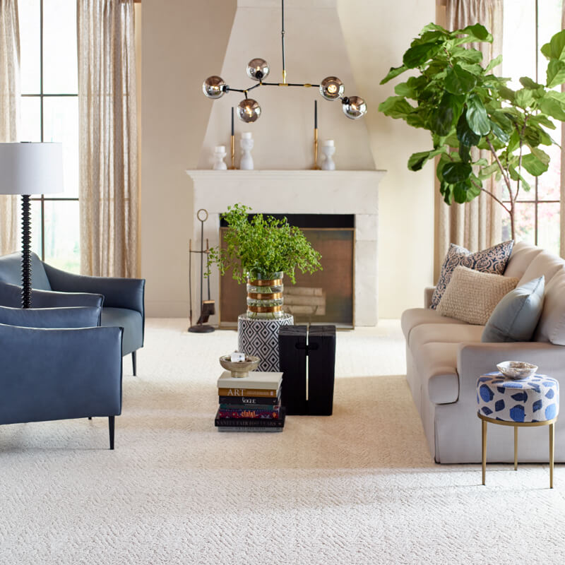
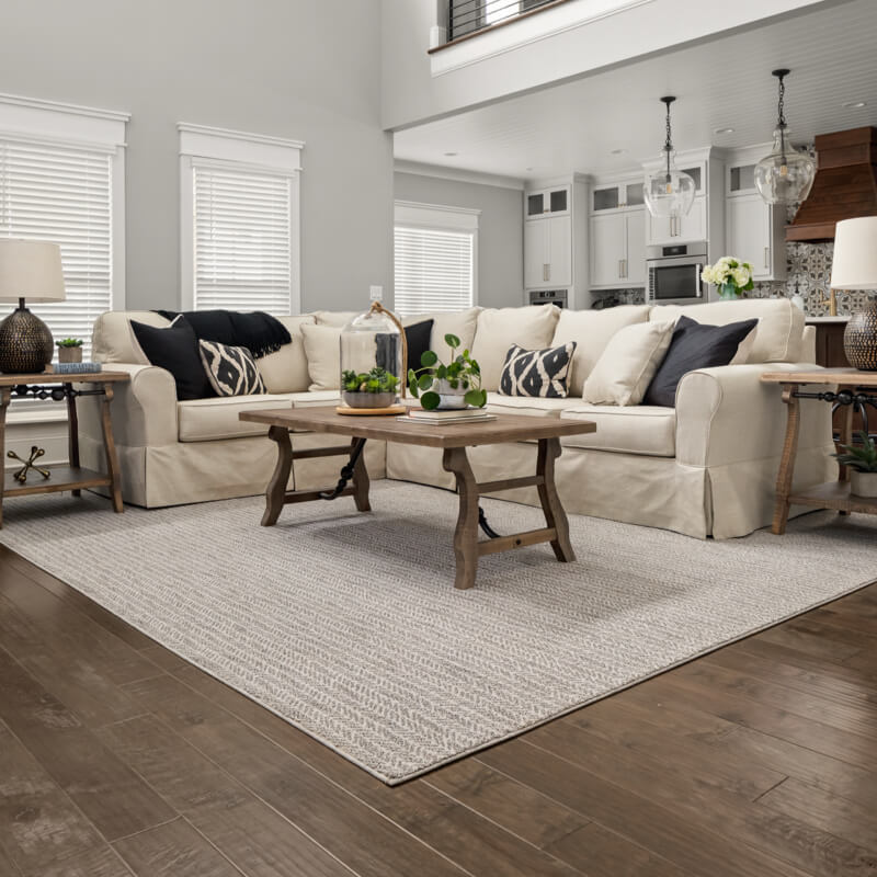
Living Room
The living room is often one of the most used spaces in the home, so durability and light control are important. A high-traffic carpet with subtle color variation, such as a heathered style, helps disguise lint and footprints while still looking polished. At the window, layered treatments work well. A practical blind or shade provides privacy and glare control, while drapery panels add softness and visual balance. The fabric at the window complements the comfort of the carpet and gives the space a finished feel.
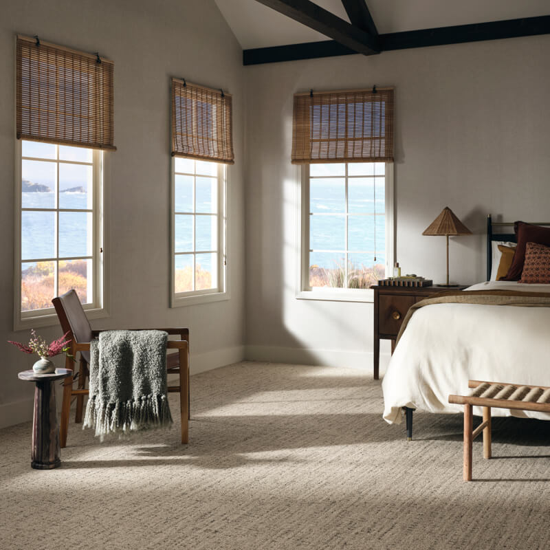
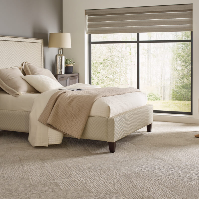
Bedroom
In the bedroom, the goal is usually comfort and better sleep. Plush, high-pile carpet creates a soft landing underfoot and adds warmth. To coordinate, consider window treatments with blackout liners to block unwanted light. The heavier fabric of blackout drapes pairs naturally with thicker carpet, reinforcing a sense of quiet and privacy. If your carpet is light in color, drapes in calming tones like sage or dusty blue can enhance the restful atmosphere without overpowering the space.
Dining Room
Dining rooms tend to feature more structured furniture, so the flooring and window treatments should feel equally intentional. A low-pile or subtly patterned rug allows chairs to move more easily and handles everyday use more gracefully. Roman shades or tailored panels mirror the clean lines of a dining table while adding softness through fabric. The result feels polished but still comfortable.
Achieving a Seamless Look from Floor to Window
When carpet and window treatments are chosen with intention, the room feels settled and cohesive from the ground up. Color relationships feel natural. Textures support one another. Pattern and scale add interest without distraction. Instead of competing for attention, each element plays a clear role in shaping the space.
Seeing these materials together in person makes the decision process far easier. Comparing carpet samples with fabric swatches in your own lighting helps you notice undertones, texture differences, and overall balance before anything is installed.
At Broadway Carpet & Flooring in Knoxville, TN, we’ll help you explore your carpet options to find the right combination for your home. When you can see and feel the materials side by side, you can move forward with confidence.